Digital Health · Accessibility · Data Visualization
WellOff Data Visualization
Helping an early-stage mental health platform turn medication tapering, one of the most clinically underserved and high-trust journeys there is, into something people could actually see and understand.
The Context
WellOff was started by founder Taylor Fisher after her own experience coming off a long-term antidepressant, and finding almost nothing built to help people through it. Tapering off medication like this is a slow, disorienting process, physically and cognitively, and the tools that existed for tracking it were never designed with that reality in mind.
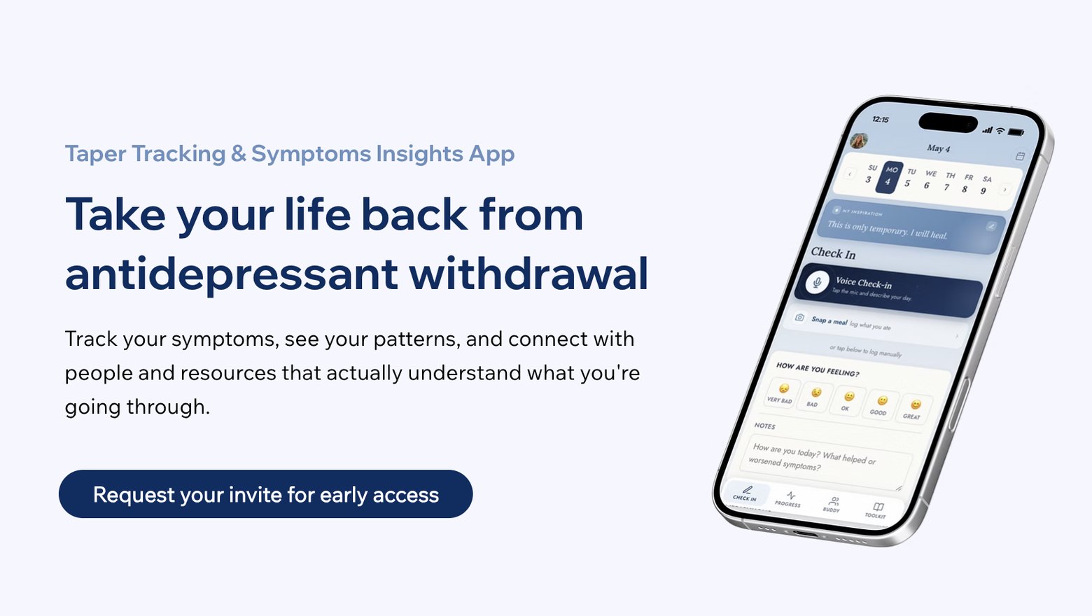
Taylor brought me on as the team was building toward its first closed beta, a symptom-, habit-, and medication-tracking app meant to give people going through tapering a way to see their own patterns and bring something concrete back to their provider.
The Ask
I came in as a product and UX advisor, working directly with Taylor on the tools at the core of the app: symptom tracking, medication tracking, and progress charts. My job was to push on how those tools were designed, how the data users logged got interpreted and shown back to them, and whether any of it would actually hold up for people whose cognition was already taxed by what they were going through.
That last piece mattered most. Tapering can affect memory, focus, and processing speed, so an interface that was clear to a typical user could still fail the people WellOff was built for.
The Work
I started with what tapering actually feels like.
Before touching any screen, I worked to understand the emotional and cognitive weight of protracted withdrawal, so my feedback was grounded in what users could realistically process, not just what looked clean on a mockup.
Then I gave feedback on the core tools themselves.
I reviewed the symptom tracking, medication tracking, and progress chart features with Taylor, flagging where the flow asked too much of someone in a fragile state and where it could be simplified without losing what made the data useful.
I advised on how the data got interpreted.
Logging a symptom is one thing; understanding what it means over weeks is another. I worked through how patterns in the data should be surfaced back to users in ways that felt clear rather than clinical or overwhelming.
And I kept accessibility at the center of it.
Every recommendation I made came back to the same question: would this still make sense to someone whose memory and focus were compromised? That lens shaped the visualization and interaction design choices throughout.
The Outcome
Here's what came out of it:
UX Review Rounds Delivered
Structured feedback on the lo-fi prototype and a follow-up deep dive on the Progress chart specifically, each translating withdrawal-cognition research into concrete design recommendations.
Visualization Concepts Evaluated
From heatmap strips to capsule overlays to comparison modes, before landing on a single recommendation: a clean line chart with tap-to-reveal daily detail.
Closed Beta Launched
WellOff shipped its closed beta and opened a waitlist, built around the tools we refined together.